Pride and Prejudice : Looking Deeper
People often say never to judge a book by its cover; however, looking at a book cover is a fundamental part of discovering what a book has in store. In the case of Pride of Prejudice, many adaptations were produced, such as the one by the Andrews McMeel publishing group. Andrew McMeel's group has published a good deal of books, many involving fairy tales and "posh" type books. Though having this cleaner style cover, it shows a simplicity that evolves into a deeper meaning when reading the book.
About the Cover
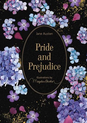
Diving deeper into the book's detailing gives the impression of a fairy tale genre. The cover is a solid black with blue and purple hydrangeas covering the front cover. The title Pride and Prejudice is in a portrait-like frame in gold lettering, centered with the flowers surrounding it. Within the flowers, gold splattering is spread around the front and the back. There are no pictures of characters or settings that are a clear giveaway of what the book is about. From a first impression standpoint, this cover would seem pretty and simple, but readers would need help understanding what they are in for.
Breaking it Down
In contrast, this book cover has a deeper meaning when knowing what the book entails and knowing the characters. The book cover could show the contrast between pride and a natural person. This could be seen in the book's title, which is in a portrait-like frame. It is presented neatly with no flowers or gold specks touching the lettering or inside the frame hence our pride side of Mr. Darcy and not showing people who he is and even the relationship that is started with Elizabeth as seen here, "Which do you mean?" and turning round, he looked for a moment at Elizabeth, till catching her eye, he withdrew his own and coldly said, "She is tolerable; but not handsome enough to tempt me; and I am in no humour at present to give consequence to young ladies whom other men slight. You had better return to your partner and enjoy her smiles, for you are wasting your time with me." (Chapter 3).
Looking outside the title, flowers are everywhere, and gold is splattered messily, which can symbolize the messy relationship between Darcy and Elizabeth as their walls start to come down. "She began now to comprehend that he was exactly the man who, in disposition and talents, would most suit her. His understanding and temper, though unlike her own, would have answered all her wishes. It was a union that must have been to the advantage of both: by her ease and liveliness, his mind might have been softened, his manners improved; and from his judgement, information, and knowledge of the world, she must have received benefit of greater importance." (Chapter 50) This is also shown through the color pallet of the cover and the inside pages. The flowers are blue and pink, but some are purple, which is a mix of the two colors, which can symbolize the mixing of the families. This simple cover quickly turns messy once you know what the book is about. Simple, like the characters show, but chaotic behind closed doors.
Inclusions to the Book
Along with the outside cover, there are also inside elements of the book. These include an invitation, a family tree, a map of London, a letter to Elizabeth, and a biography of Jane Austen. These elements, although not essential to the production of the book, reflect the novel well. It brings the reader into the period of the setting and creates a deeper understanding of what is happening. This shows the timeless quality of Jane Austen and how centuries have passed, yet her work is still being produced with different adaptations to show the different aspects of her work. This adaptation specifically shows the contradiction between the clean and messy of the time.
Concluding Thoughts
With the many adaptations that there are of the book, this one stick out in particular with the simplicity of the cover. It hides the deeper meaning of the book yet shows a pretty cover that can draw the reader in.
Works Cited
Austen, Jane, and Marjolein Bastin. Pride and Prejudice. Andrews McMeel Publishing, 2021.
Pride and Prejudice, edited by Donald Gray and Mary A. Favret, 4th Norton Critical
Edition, 2016.


